
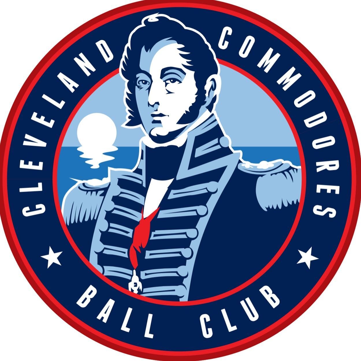
Cleveland Commodores!
In 2016, Cleveland Scene held a logo design contest. The concept was “Redesign the Tribe.” I liked the idea, so I entered.
The contest was initiated to address the issue that the identity of the Cleveland Indians—including but not limited to the Chief Wahoo logo—is problematic.
It’s funny, how I drew Wahoo on approximately a thousand times on baseball caps at Geauga Lake as a teenager before I realized that the logo and identity was something to even consider the concept of. As a native Cleveland, I've been in and out of following Tribe baseball through the years; Cleveland sports fans will understand that fandom is generally more punishing than rewarding. But my primary goal with my entry was to dig out something from the area’s past that was reminiscent of history and also not not an arguably insensitive depiction of the people who lived here before others did. I did some research and settled on “The Hero of Lake Erie.”
Oliver Hazard Perry was a prominent Navy officer during the War of 1812. His portrait looks like this:

Pretty sure I had sideburns like this in college at one point.
… and he had a remarkable life.
”He earned the title ‘Hero of Lake Erie’ for leading American forces in a decisive naval victory at the Battle of Lake Erie, receiving a Congressional Gold Medal and the Thanks of Congress. His leadership materially aided the successful outcomes of all nine Lake Erie military campaign victories, and the victory was a turning point in the battle for the west in the war. He is remembered for the words on his battle flag, ‘Don't Give Up the Ship,’ which was a tribute to the dying command of his colleague Captain James Lawrence of USS Chesapeake.”
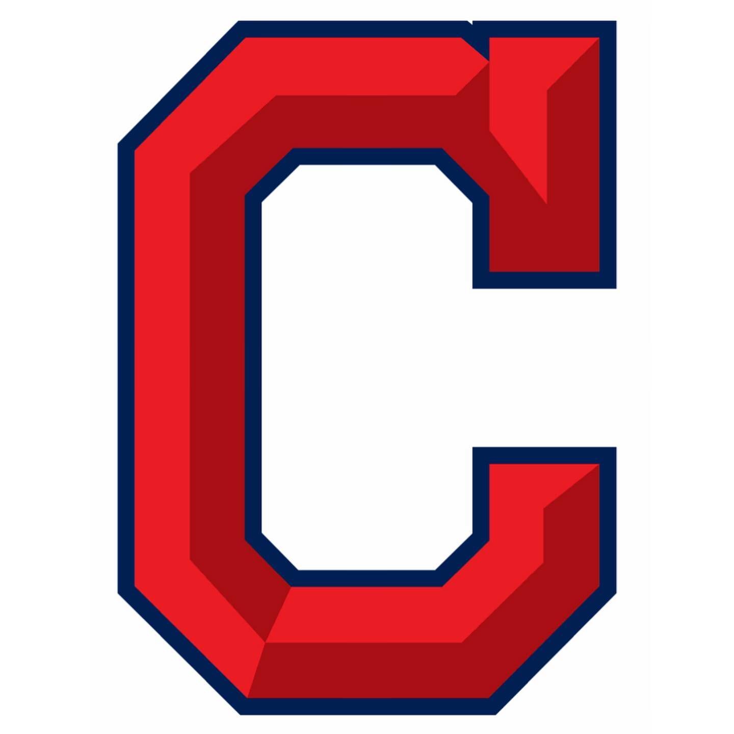
He seemed like an all-around great candidate for immortalization via an MLB logo, so I rolled with it. I like the currently used “Block C” logo—I think it’s pretty unique and it looks cool on hats—so I made some minor readjustments to it:
Man, this thing looks huge in browsers.
… especially since the intent of the Block C is to move away from Chief Wahoo.
I understand that this is controversial. I still consider Major League to be the best sports movie of all time, hands down, and the only rivals are Slap Shot, Rudy and maybe Hoosiers. Again, I drew the Wahoo logo on hats for money at an amusement park caricature stand. I own that. But when it comes down to it, I thought about it and naming sports teams after ethnicities is unnecessary. Vikings and Warriors and Irishmen are cultures, and appropriating their combative traits makes more sense to me as a respectful homage. But a general ethnicity has always seemed off to me, especially since the explorers only called them “Indians” because they thought they landed in India and didn’t care to correct themselves when they found out that wasn’t the case.
I designed uniforms; I don’t know if the influence of antiquated naval dress uniform designs came through as strongly as I had intended:

… but I liked the idea of the same brilliant red they currently use to be a sharp minimal accent among lake-palette blues.
Strongly devoted to the idea behind the contest (and also for shameless self-promotion), I shared the post for the contest on social media to generate interest in voting. When it was over, I came in 8th out of the 40 designs that they narrowed down for consideration. I’m glad I contributed to the spirit of the contest and it was really cool to see so many other solid design submissions. I didn’t win Cavs tickets. But it was still worth it.
And so ends the first of hopefully many blog posts on my (new as of this posting) site. I intend to post artwork that didn’t quite make my portfolio and new stuff I’ve spent time on.
Thanks for reading!